About Me

Monday, April 4, 2011

Day and Night: Creating a Scenery Animation with jQuery and CSS

day_and_night

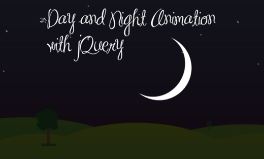
In today’s tutorial I am going to show you, how to create an amazing animated scenery with just a few lines of jQuery and some absolute positioned elements with images.
See the demo link below and check out the result. The animation takes around 30 seconds, so sit back and enjoy it!
Please note that this will NOT work in any IE version. Not because it is not possible, I simply did not have the time and energy for that. I was trying to fix it at least for IE 8 but you know, when coding starts to get ugly because of “fixing” it for IE, I sometimes loose my patience. Today was one of these days (I bet you all have them) where you say: Darwin, I Ching … IE has to die out (and not only IE6), no, the whole line!
Ok, let’s start with the coding.

1. The HTML

The HTML consists of the divs that will have the scenery as background images. So, we will have the sky, the sun, the clouds, the landscape, the moon and the stars. We will also have an element for the night and a shooting star:
<div id="sky"></div>
<div id="sun_yellow"></div>
<div id="sun_red"></div>
<div id="clouds"></div>
<div id="ground"></div>
<div id="night"></div>
<div id="stars"></div>
<div id="sstar"></div>
<div id="moon"></div>
The color change of the setting sun is simulated by the fading in of another red sun, while the yellow sun fades out.
But before we get into the animation details, let’s take a look at the CSS.

2. The CSS

The CSS is very similar for all of the elements, since most of them will be stretched over the screen. All of them have absolute positioning:
body{
    overflow:hidden;
}
#clouds, #sky, #night, #stars{
    position:absolute;
    top:0px;
    left:0px;
    right:0px;
    bottom:0px;
    width:100%;
}
When having common attributes, we can specify them for all the classes divided by commas.
#sky{
    background:#fff url(../images/sky.png) repeat-x top left;
    z-index:1;
}
The sky is composed of a semi-transparent images with a gradient from blue to white. This will give a nice effect to the sky.
#sun_yellow{
    position:absolute;
    left:45%;
    top:50%;
    width:150px;
    height:152px;
    background:transparent url(../images/sun.png) no-repeat center center;
    z-index:2;
}
#sun_red{
    position:absolute;
    left:45%;
    top:50%;
    width:150px;
    height:152px;
    background:transparent url(../images/sun2.png) no-repeat center center;
    z-index:2;
    opacity:0;
}
In the beginning of the animation, when it is daytime, we want to show a yellow sun. The sun will set, i.e. move down, and fade out slowly. At the same time, we will fade in the red sun, that will be moving the same way. So, initially, we set the position to somewhere in the center of the screen. Then, we will animate the movement and the fade out/in effects.
#clouds{
    background:transparent url(../images/clouds.png) repeat-x top left;
    z-index:3;
}
#ground{
    position:absolute;
    left:0px;
    right:0px;
    bottom:0px;
    width:100%;
    height:232px;
    background:transparent url(../images/ground.png) repeat-x bottom center;
    z-index:3;
}
The clouds and the landscape will be repeated because we want users with a bigger screen to see a complete scenery as well. Try to zoom in/out in your browser and you will see that the screen is always filled with the images. Since we set the overflow of the body to be hidden, the user will never have to scroll – he simply won’t see anything that goes beyond the browser edges.
#night{
    background-color:#000;
    z-index:4;
    opacity:0;
}
#stars{
    bottom:200px;
    background:transparent url(../images/stars.png) repeat bottom center;
    z-index:5;
    opacity:0;
}
The night will simply be a div stretched over all the screen with a background color of black. We will make it appear slowly by setting its opacity higher, hence making it less transparent.
#sstar{
    position:absolute;
    left:40%;
    top:10%;
    width:126px;
    height:80px;
    background:transparent url(../images/shootingstar.png) no-repeat 80px -200px;
    z-index:5;
    opacity:0;
}
The shooting star will be a special element: the image is a simple inclined white line. We will make it appear like a shooting star by moving its background position and fading it out. Because of that, we need to set the initial background position to 80px horizontally (xpos) and -200px vertically (ypos). So basically, we want to place it in the outer top right corner and then make it appear in the “visible area”.
#moon{
    position:absolute;
    left:45%;
    top:60%;
    width:168px;
    height:168px;
    background:transparent url(../images/moon.png) no-repeat center center;
    z-index:6;
    opacity:0;
}
With the increasing z-indexes, we define which element will be on top of the other. Of course, if we list them in the HTML accordingly, we will have the same effect, but it is always better to make sure of it in the CSS. To all the elements that we don’t want to show from the beginning on, we give an opacity value of 0, hence making them transparent.
And that’s the CSS part. Now, let’s look at the magical JavaScript.

3. The JavaScript

In order to animate the background color of the sky, we will use a jQuery plugin which can be found here.  Simply include it after you include the main jQuery script.
Let’s first take a look at the whole JavaScript that we will define:
$(function() {
   $('#sun_yellow').animate({'top':'96%','opacity':0.4}, 12000,function(){
       $('#stars').animate({'opacity':1}, 5000,function(){
            $('#moon').animate({'top':'30%','opacity':1}, 5000, function(){
                $('#sstar').animate({'opacity':1}, 300);
                $('#sstar').animate({
                    'backgroundPosition':'0px 0px','top':'15%', 'opacity':0
                }, 500);
            });
       });
   });
   $('#sun_red').animate({'top':'96%','opacity':0.8}, 12000);
   $('#sky').animate({'backgroundColor':'#4F0030'}, 18000);
   $('#clouds').animate({'backgroundPosition':'1000px 0px','opacity':0}, 30000);
   $('#night').animate({'opacity':0.8}, 20000);
});
In line 2 and 12 to 16 we define what shall happen at the same time. The last integer stands for the milliseconds, the duration of the effect. The yellow sun shall take 12 seconds to move down and to become more transparent, while at the same time, the red sun becomes more opaque (but it moves down, too).
The sky (line 13) shall take 18 seconds to change its background color from white (like we defined in the CSS) to a dark purple.
The clouds (line 14) will appear to be moving because we define an animated change of the background position which takes 30 seconds. We also state that they shall become transparent in the end (so that we have a clear night sky).
Since we want the whole scenery to get darker, we make the night fall by increasing the opacity of the black div.
Now, let’s see what happens in the functions that should start after the sun has set (line 3 to 10).
First, we want the stars to slowly “fade in” by setting the opacity higher. After that has happened, we want the moon to appear from bottom to the center by fading in. Then, the shooting star shall appear. This we simulate by changing it’s background position to 0px 0px and moving it down a little bit. Additionally, to make it a real shooting star, we make it disappear very quickly :) by setting the opacity to 0.
And that’s it! I hope you enjoyed it!

jPaginate: A Fancy jQuery Pagination Plugin

jPaginatejPaginate is a jQuery pagination plugin that comes with a twist: animated page numbers. The user can slide through the available page numbers by clicking or just hovering over the arrows. Shortlinks to the first and last page are available as well.

You can call the plugin in the following way:
$(elementID).paginate()
You can configure the plugin with the following properties:
  1. count: The total number of pages
  2. start: With which number the visible pages should start
  3. display: How many page numbers should be visible
  4. border: If there should be a border (true/false)
  5. border_color: Color of the border
  6. text_color: Color of the text/numbers
  7. background_color: Background color
  8. border_hover_color: Border color when hovering
  9. text_hover_color: Text color when hovering
  10. background_hover_color: Background color when hovering
  11. images: If the arrows should be images or not (true/false)
  12. mouse: With value “press” the user can keep the mouse button pressed and the page numbers will keep on sliding. With value “slide” the page numbers will slide once with each click.
  13. onChange: The callback function when clicking on a page. As argument the number of the page clicked can be used.

A Fresh Bottom Slide Out Menu with jQuery

bottomSlideOut

In this tutorial we will create a unique bottom slide out menu. This large menu will contain some title and a description of the menu item. It will slide out from the bottom revealing the description text and some icon. We will use some CSS3 properties for some nice shadow effects and jQuery for the interaction.
The Luna Grey iconset can be downloaded at DryIcons: http://dryicons.com/free-icons/preview/luna-grey-icons/
In the downloadable ZIP I will not be able to provide them, but I kept the naming, so that you can easily integrate it.
Ok, let’s start with the Markup.

The Markup

The menu will be placed inside of a container. The menu itself will be an unordered list with link elements inside. The link elements will contain two spans: one for the title and one for the description. We will also have an i element for the icon:

<div class="container">
 <ul id="menu">
  <li>
   <a>
    <i class="icon_about"></i>
    <span class="title">About</span>
    <span class="description">
     Learn about us and our services
    </span>
   </a>
  </li>
   <li>
   <a>
    <i class="icon_work"></i>
    <span class="title">Work</span>
    <span class="description">
     See our work and portfolio
    </span>
   </a>
  </li>
  <li>
   <a>
    <i class="icon_help"></i>
    <span class="title">Help</span>
    <span class="description">
     Talk to our support
    </span>
   </a>
  </li>
   <li>
   <a>
    <i class="icon_search"></i>
    <span class="title">Search</span>
    <span class="description">
     Search our website
    </span>
   </a>
  </li>
 </ul>
</div>

Don’t forget to adapt the link element and to add your destination into an href if you need to.

The CSS

Let’s start with the style of the surrounding container. The container will be of relative position since we will make the menu absolute. We will have to hide the description part of the menu items and so we will hide any overflow of the container. If you place this menu absolutely to the page, i.e. at the bottom, the description part will simply disappear outside of you window. This container allows you to see how to implement this menu relatively to some other element:

.container{
    width:900px;
    height:130px;
    margin:0 auto;
    position:relative;
    overflow:hidden;
    border:3px solid #fff;
 background-color:#fff;
    -moz-box-shadow:1px 1px 6px #000;
    -webkit-box-shadow:1px 1px 6px #000;
    -moz-border-radius:0px 0px 20px 20px;
    -webkit-border-bottom-left-radius:20px;
    -webkit-border-bottom-right-radius:20px;
    border-radius:0px 0px 20px 20px;
}

We create some fancy shadowing and rounded borders with the CSS3 properties. Keep in mind that they will only work in modern browsers (so, basically all except marvelous IE).
The list will have the following style:

ul#menu{
    list-style:none;
    position:absolute;
    bottom:0px;
    left:20px;
    font-size:36px;
    font-family: Helvetica, Arial, sans-serif;
    font-weight: bold;
    color:#999;
    letter-spacing:-2px;
}
ul#menu li{
    float:left;
    margin:0px 10px 0px 0px;
}
ul#menu a{
    cursor:pointer;
    position:relative;
    float:left;
    bottom:-95px;
    line-height:20px;
    width:210px;
}

As you can see, we hide the push the link element down in order to almost hide the description span. We do that by giving a negative bottom position. You can adapt this value to make the span appear a little bit more or not at all.
Now, let’s take a look at the classes for the icons:

.icon_about,
.icon_work,
.icon_help,
.icon_search{
    width:64px;
    height:64px;
    display:block;
    left:140px;
    top:50px;
    position:absolute;
}
.icon_about{
    background:transparent url(../images/id_card.png) no-repeat top left;
}
.icon_work{
    background:transparent url(../images/globe.png) no-repeat top left;
}
.icon_help{
    background:transparent url(../images/help.png) no-repeat top left;
}
.icon_search{
    background:transparent url(../images/find.png) no-repeat top left;
}

The CSS of the title and description spans will look as follows:

ul#menu span.title{
    display:block;
    height:26px;
    text-shadow:1px 1px 1px #000;
    color:#B7B7B6;
    text-indent:10px;
}
ul#menu span.description{
    width:140px;
    height:80px;
    background-color:#B7B7B6;
    border:3px solid #fff;
    color:#fff;
    display:block;
    font-size:24px;
    padding:10px;
    -moz-box-shadow:1px 1px 6px #000;
    -webkit-box-shadow:1px 1px 6px #000;
    box-shadow:1px 1px 6px #000;
    -moz-border-radius:10px;
    -webkit-border-radius:10px;
    border-radius:10px;
}

We also want the two spans to change text and background color, so we define the style for the hover of the parent link element:

ul#menu a:hover span.description{
    background-color:#54504F;
}
ul#menu a:hover span.title{
    color:#54504F;
}

And that’s all the style. Now, let’s add some nice interaction effects with jQuery.

The Javascript

The JavaScript will be pretty straightforward since we will only do two things: slide out the link element and the icon. The following function makes that happen (and the opposite when we move the mouse out):

$(function() {
    $('#menu > li').hover(
        function () {
            var $this = $(this);
            $('a',$this).stop(true,true).animate({
                    'bottom':'-15px'
                }, 300);
            $('i',$this).stop(true,true).animate({
                    'top':'-10px'
                }, 400);
        },
        function () {
            var $this = $(this);
            $('a',$this).stop(true,true).animate({
                    'bottom':'-95px'
                }, 300);
            $('i',$this).stop(true,true).animate({
                    'top':'50px'
                }, 400);
        }
    );
});

In order to slide out the link element, we change the bottom position and animate that. For the icon we change the top value and give the effect more time, since we want to create a little delay.
And that’s it! Enjoy it!

Sliding Panel Photo Wall Gallery with jQuery


Today we will create a stunning full page photo wall gallery. The idea is to have a whole page full of thumbs with a nice light effect when we hover. When an image is clicked, a panel slides up from the bottom revealing the full picture. When clicking on the full image, the thumbs panel slide back from the bottom. This effect will give the impression that we are stacking the panels on top of each other every time we change the mode. In the full picture view we add some nice transition effect when we browse through the photos.
In addition, we will use a function for resizing the full image, adapting it to the size of the screen. So, when the screen get’s resized, our image will adapt automatically!
The beautiful images in the demo are from Vincent Boiteau’s photostream on Flickr.
This tutorial will be a little bit more complex than usual, so I will give my best to explain things clearly.
Let’s get started with the markup.

The Markup

The HTML structure consists of three main containers: one for the info bar at the bottom of the page, one for the thumbnails and one panel container for the full image:

<div class="infobar">
 <span id="description"></span>
 <span id="loading">Loading Image</span>
</div>
<div id="thumbsWrapper">
 <div id="content" >
  <img src="thumbs/1.JPG" alt="images/1.JPG" title="something"/>
  <img src="thumbs/2.JPG" alt="images/2.JPG" title="something"/>
  ...
  <div class="placeholder"></div>
 </div>
</div>
<div id="panel">
 <div id="wrapper">
  <a id="prev"></a>
  <a id="next"></a>
 </div>
</div>

The info bar container has a span for the image description and one for the loading display. The thumbnail wrapper contains a content container for all the small images. The very last element after the thumbnails is a placeholder. We need to add some space to the end because we don’t want the thumbnails to get covered by the info bar. Since we don’t want to use any paddings or margins in our containers, we simply add another filler element.
The structure for the panel contains a wrapper for the full image and two navigation items. In our JavaScript function we will add the full size image to this wrapper.
Now, let’s take a look at the style.

The CSS

First, we will define some general style for the page:

*{
    margin:0;
    padding:0;
}
body{
    background-color:#000;
    font-family:Verdana;
    text-transform:uppercase;
    color:#fff;
    font-size:10px;
    overflow:hidden;
}

The body needs to get the property overflow hidden, because we will set the scroll bar for the thumbs view only. If we would add scrolling to the page, the scroll bar would appear when the full image panel slides up. We avoid that by saying that the overflow will be hidden for the body.
The info bar will have a fixed position. We always want it to be visible and at the same place in the page:

.infobar{
    background-color:#000;
    height:28px;
    line-height:28px;
    right:20px;
    position:fixed;
    bottom:0px;
    left:20px;
    z-index:999999999;
    text-align:center;
    color:#ddd;
    -moz-border-radius:10px 10px 0px 0px;
    -webkit-border-top-left-radius:10px;
    -webkit-border-top-right-radius:10px;
    border-top-left-radius:10px;
    border-top-right-radius:10px;
    text-shadow:0px 0px 1px #ccc;
}

We add some border radius for rounded borders. We set the z-index crazily high since we want the element to be always on top. of course you could just use a value like 15 or 50. Just be careful with the other elements that will get a new z-index dynamically in the JS. The highest one of them is 10.
The description and the loading item will have the following style:

span#description{
    text-shadow:1px 1px 1px #000;
    display:none;
}
span#loading{
    display:none;
    padding-right: 30px;
    background:transparent url(../loading.gif) no-repeat center right;
}

The loading item will have a loading image as background.
The thumbs wrapper will have a panel like style. We set it fixed, occupying the whole screen.Important for the effect is the bottom:0px since we will want the wrapper to come up from the bottom by animating its height. Again, we set the overflow to hidden, since we just want the content container to have a scroll bar.

#thumbsWrapper{
    overflow:hidden;
    position:fixed;
    height:100%;
    width:100%;
    left:0px;
    right:0px;
    bottom:0px;
}

The content wrapper will also occupy all the page. The vertical scroll bar we set explicitly by saying overflow-y:scroll (auto would be the default value). Initially, we want this container to be invisible because we don’t want to show the scroll bar while there is nothing on the page during the initial loading time.

#content{
   position:absolute;
   top:0px;
   height:100%;
   width:100%;
   left:0px;
   background-color:#111;
   overflow-y:scroll;
   display:none;
}

The images in the content container will float left and have an opacity of 0.4. The hover function will then increase opacity, giving the whole thing a spotlight effect.

#content img{
    float:left;
    margin:2px;
    cursor:pointer;
    opacity:0.4;
    filter:progid:DXImageTransform.Microsoft.Alpha(opacity=40);
}

The placeholder will make sure that our thumbs don’t get covered by the info bar when we are at the bottom of the page:

.placeholder{
    float:left;
    clear:both;
    width:100%;
    height:30px;
}

The panel will have the following style similar to the style of the thumbs wrapper:

#panel{
    background-color:#222;
    width:100%;
    position:fixed;
    bottom:0px;
    left:0px;
    right:0px;
    height:0px;
    text-align:center;
}

Initially, the

#panel img{
    cursor:pointer;
    position:relative;
    border:1px solid #000;
    -moz-box-shadow:0px 0px 10px #111;
    -webkit-box-shadow:0px 0px 10px #111;
    box-shadow:0px 0px 10px #111;
    display:none;
}

We set it to display:none since we will make it appear by fading it in. This will create a nice effect.
The image wrapper be centered horizontally. This we achieve by setting the left and right margins to auto.

#wrapper{
    position:relative;
    margin:40px auto 0px auto;
}

The navigation items will have the following style:

a#next,
a#prev{
    width:40px;
    height:40px;
    position:fixed;
    cursor:pointer;
    outline:none;
    display:none;
    background:#aaa url(../nav.png) no-repeat top left;
}
a#next:hover, a#prev:hover{
    background-color:#fff;
}
a#next{
    right:0px;
    top:50%;
    margin-top:-20px;
    background-position: 0px 0px;
}
a#prev{
    left:0px;
    top:50%;
    margin-top:-20px;
    background-position: 0px -40px;
}

We give the navigation items a fixed position. To center an absolute or fixed element horizontally (or vertically) you can give it a top (or left) value of 50% and then a negative top (or left) margin of half of its height (or width). Since the navigation item is 40px high, our top margin is is -20px.
And that was all the style. Now, let’s take a look at the JavaScript magic:

The JavaScript

OK, don’t scare, it’s a bit lengthy… but don’t worry, most of it is comments and code indention :)
Our main functions fire when we click on a thumb or click on a full image.
When clicking on a thumbnail (line 34) we first show our loading item in the info bar. Then we say to load the respective image (line 40) with the source being the alt attribute of the thumb we clicked (line 92). Everything that is inside of the load function will just be executed after the image is loaded (line 41 to 93). So, we hide the loading item from the info bar, resize the image to fit into the viewport and append the image element to the wrapper. Then we fade it in (line 54) and slide up the panel where we will see the full image and the fading in effect still executing (57 – 91). We also show the description and the navigation items, and finally we make the thumbs wrapper disappear by setting the height to 0 (line 90). We do that because we want it sliding back from the bottom when we click on the full image.
For the click event on the full image (line 101 to 119) we need to use “live” since the img element is not there in the beginning but it is created dynamically. We animate the thumbs wrapper and set the panel to zero height.
The functions for browsing through the full images check which thumb image is the previous or next one and according to that we set the next or previous full image (line 128 to 137). For that we use the navigate function (line 143 to 191).
From line 18 to 26 we say that we want the full size picture to be resized whenever we resize the window. The resize function is defined from line 197 until 237. We also resize the wrapper around the image.

$(function() {
 /* this is the index of the last clicked picture */
 var current = -1;
 /* number of pictures */
 var totalpictures = $('#content img').size();
 /* speed to animate the panel and the thumbs wrapper */
 var speed  = 500;

 /* show the content */
 $('#content').show();

 /*
 when the user resizes the browser window,
 the size of the picture being viewed is recalculated;
  */
 $(window).bind('resize', function() {
  var $picture = $('#wrapper').find('img');
  resize($picture);
 });

 /*
 when hovering a thumb, animate it's opacity
 for a cool effect;
 when clicking on it, we load the corresponding large image;
 the source of the large image is stored as
 the "alt" attribute of the thumb image
  */
 $('#content > img').hover(function () {
  var $this   = $(this);
  $this.stop().animate({'opacity':'1.0'},200);
 },function () {
  var $this   = $(this);
  $this.stop().animate({'opacity':'0.4'},200);
 }).bind('click',function(){
  var $this   = $(this);

  /* shows the loading icon */
  $('#loading').show();

  $('').load(function(){
   $('#loading').hide();
   if($('#wrapper').find('img').length) return;
   current  = $this.index();
   var $theImage   = $(this);
   /*
   After it's loaded we hide the loading icon
   and resize the image, given the window size;
   then we append the image to the wrapper
   */
   resize($theImage);

   $('#wrapper').append($theImage);
   /* make its opacity animate */
   $theImage.fadeIn(800);

   /* and finally slide up the panel */
   $('#panel').animate({'height':'100%'},speed,function(){
    /*
    if the picture has a description,
    it's stored in the title attribute of the thumb;
    show it if it's not empty
     */
    var title = $this.attr('title');
    if(title != '')
     $('#description').html(title).show();
    else
     $('#description').empty().hide();

    /*
    if our picture is the first one,
    don't show the "previous button"
    for the slideshow navigation;
    if our picture is the last one,
    don't show the "next button"
    for the slideshow navigation
     */
    if(current==0)
     $('#prev').hide();
    else
     $('#prev').fadeIn();
    if(current==parseInt(totalpictures-1))
     $('#next').hide();
    else
     $('#next').fadeIn();
    /*
    we set the z-index and height of the thumbs wrapper
    to 0, because we want to slide it up afterwards,
    when the user clicks the large image
     */
    $('#thumbsWrapper').css({'z-index':'0','height':'0px'});
   });
  }).attr('src', $this.attr('alt'));
 });

 /*
 when hovering a large image,
 we want to slide up the thumbs wrapper again,
 and reset the panel (like it was initially);
 this includes removing the large image element
  */
 $('#wrapper > img').live('click',function(){
  $this = $(this);
  $('#description').empty().hide();

  $('#thumbsWrapper').css('z-index','10')
  .stop()
  .animate({'height':'100%'},speed,function(){
   var $theWrapper = $(this);
   $('#panel').css('height','0px');
   $theWrapper.css('z-index','0');
   /*
   remove the large image element
   and the navigation buttons
    */
   $this.remove();
   $('#prev').hide();
   $('#next').hide();
  });
 });

 /*
 when we are viewing a large image,
 if we navigate to the right/left we need to know
 which image is the corresponding neighbour.
 we know the index of the current picture (current),
 so we can easily get to the neighbour:
  */
 $('#next').bind('click',function(){
  var $this           = $(this);
  var $nextimage   = $('#content img:nth-child('+parseInt(current+2)+')');
  navigate($nextimage,'right');
 });
 $('#prev').bind('click',function(){
  var $this           = $(this);
  var $previmage   = $('#content img:nth-child('+parseInt(current)+')');
  navigate($previmage,'left');
 });

 /*
 given the next or previous image to show,
 and the direction, it loads a new image in the panel.
  */
 function navigate($nextimage,dir){
  /*
  if we are at the end/beginning
  then there's no next/previous
   */
  if(dir=='left' && current==0)
   return;
  if(dir=='right' && current==parseInt(totalpictures-1))
   return;
  $('#loading').show();
  $('').load(function(){
   var $theImage = $(this);
   $('#loading').hide();
   $('#description').empty().fadeOut();

   $('#wrapper img').stop().fadeOut(500,function(){
    var $this = $(this);

    $this.remove();
    resize($theImage);

    $('#wrapper').append($theImage.show());
    $theImage.stop().fadeIn(800);

    var title = $nextimage.attr('title');
    if(title != ''){
     $('#description').html(title).show();
    }
    else
     $('#description').empty().hide();

    if(current==0)
     $('#prev').hide();
    else
     $('#prev').show();
    if(current==parseInt(totalpictures-1))
     $('#next').hide();
    else
     $('#next').show();
   });
   /*
   increase or decrease the current variable
    */
   if(dir=='right')
    ++current;
   else if(dir=='left')
    --current;
  }).attr('src', $nextimage.attr('alt'));
 }

 /*
 resizes an image given the window size,
 considering the margin values
  */
 function resize($image){
  var windowH      = $(window).height()-100;
  var windowW      = $(window).width()-80;
  var theImage     = new Image();
  theImage.src     = $image.attr("src");
  var imgwidth     = theImage.width;
  var imgheight    = theImage.height;

  if((imgwidth > windowW)||(imgheight > windowH)){
   if(imgwidth > imgheight){
    var newwidth = windowW;
    var ratio = imgwidth / windowW;
    var newheight = imgheight / ratio;
    theImage.height = newheight;
    theImage.width= newwidth;
    if(newheight>windowH){
     var newnewheight = windowH;
     var newratio = newheight/windowH;
     var newnewwidth =newwidth/newratio;
     theImage.width = newnewwidth;
     theImage.height= newnewheight;
    }
   }
   else{
    var newheight = windowH;
    var ratio = imgheight / windowH;
    var newwidth = imgwidth / ratio;
    theImage.height = newheight;
    theImage.width= newwidth;
    if(newwidth>windowW){
     var newnewwidth = windowW;
     var newratio = newwidth/windowW;
     var newnewheight =newheight/newratio;
     theImage.height = newnewheight;
     theImage.width= newnewwidth;
    }
   }
  }
  $image.css({'width':theImage.width+'px','height':theImage.height+'px'});
 }
});

For further details, check the comments in the code, they describe what is done in the moment.
And that’s it! I hope you enjoyed the tutorial and the result!

CSS and jQuery Tutorial: Fancy Apple-Style Icon Slide Out Navigation

applelikenav
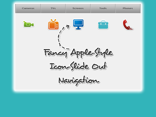
Today I want to show you, how to create an Apple-style navigation menu with a twist. Although “fancy” and “Apple-style” don’t really go together, I thought that it’s time for something different.
This menu looks very similar to the Apple-style navigation but it reveals some icons when hovering over it. The icons slide out from the top and when the mouse leaves the link, the icon slides back under the link element. This creates a neat “card-shuffle” effect.
The icons used in this tutorial can be found on DryIcons.com. I am not allowed to redistribute the icons under the free license, so I did not include them in the downloadable ZIP file. But you can easily find them here. I did not rename them for the tutorial so that you can easily recreate the navigation without changing the names or the stylesheet.
Ok, let’s get started!

1. The HTML

The markup just consists of a div with an unordered list inside. The list elements contain a span for the icon and the link element:
<div class="navigation">
 <ul class="menu" id="menu">
 <li><span class="ipod"></span><a href="" class="first">Players</a></li>
 <li><span class="video_camera"></span><a href="">Cameras</a></li>
 <li><span class="television"></span><a href="">TVs</a></li>
 <li><span class="monitor"></span><a href="">Screens</a></li>
 <li><span class="toolbox"></span><a href="">Tools</a></li>
 <li><span class="telephone"></span><a href="">Phones</a></li>
 <li><span class="print"></span><a href="" class="last">Printers</a></li>
 </ul>
</div>

2. The CSS

The style of the navigation container and the unordered list will be the following:
.navigation{
    position:relative;
    margin:0 auto;
    width:915px;
}
ul.menu{
    list-style:none;
    font-family:"Verdana",sans-serif;
    border-top:1px solid #bebebe;
    margin:0px;
    padding:0px;
    float:left;
}
ul.menu li{
    float:left;
}
Since we are making the list float, we will need some relative wrapper for the icons. You see, the icons which will be the background-images of the spans in our list, will have absolute positioning. That comes handy when you need to define a z-index, i.e. saying that some element is on top or under another one. Since we want the icons to appear on top and then dissapear under the link element, we will have to deal with z-indeces. And absolute positioning of elements in a relative container will makes things easier.
Now, let’s define the style for the link elements:
ul.menu li a{
    text-decoration:none;
    background:#7E7E7E url(../images/bgMenu.png) repeat-x top left;
    padding:15px 0px;
    width:128px;
    color:#333333;
    float:left;
    text-align:center;
    border-right:1px solid #a1a1a1;
    border-left:1px solid #e8e8e8;
    font-weight:bold;
    font-size:13px;
    -moz-box-shadow: 0 1px 3px #555;
    -webkit-box-shadow: 0 1px 3px #555;
    text-shadow: 0 1px 1px #fff;
}
We want to give the link elements a fixed width and some background gradient. The borders will create a nice inset effect.
The next hover class will be applied using jQuery, since the :hover pseudo class creates an unwanted effect: When the icon slides out it covers the link for a few milliseconds, making the hover style dissapear in that time. That is perceived as a flicker and we will avoid that by defining a class that we will simply add with jQuery when we do the icon slide out effect:
ul.menu li a.hover{
    background-image:none;
    color:#fff;
    text-shadow: 0 -1px 1px #000;
}
The first and last link element should have a rounded border on the respective side, so we define two classes for those:
ul.menu li a.first{
    -moz-border-radius:0px 0px 0px 10px;
    -webkit-border-bottom-left-radius: 10px;
    border-left:none;
}
ul.menu li a.last{
    -moz-border-radius:0px 0px 10px 0px;
    -webkit-border-bottom-right-radius: 10px;
}
The common style for all the icon spans will be the following:
ul.menu li span{
    width:64px;
    height:64px;
    background-repeat:no-repeat;
    background-color:transparent;
    position:absolute;
    z-index:-1;
    top:80px;
    cursor:pointer;
}
The single styles for the specific icons will contain the background-image and the x-position:
ul.menu li span.ipod{
    background-image:url(../icons/ipod.png);
    left:33px; /*128/2 - 32(half of icon) +1 of border*/
}
ul.menu li span.video_camera{
    background-image:url(../icons/video_camera.png);
    left:163px; /* plus 128 + 2px of border*/
}
ul.menu li span.television{
    background-image:url(../icons/television.png);
    left:293px;
}
ul.menu li span.monitor{
    background-image:url(../icons/monitor.png);
    left:423px;
}
ul.menu li span.toolbox{
    background-image:url(../icons/toolbox.png);
    left:553px;
}
ul.menu li span.telephone{
    background-image:url(../icons/telephone.png);
    left:683px;
}
ul.menu li span.print{
    background-image:url(../icons/print.png);
    left:813px;
}
As you can see, we are positioning the icons in such a way, that they are centered inside of the list element. The top position is 80px initially since we want to show them to the user when the page get’s loaded. Then we will hide them in a stair-like fashion to create an awesome effect!

3. The JavaScript

First, we want to create the effect of the icons dissapearing in a stair-like fashion and then we will define the hover function for the list elements:
$(function() {
    var d=1000;
    $('#menu span').each(function(){
        $(this).stop().animate({
            'top':'-17px'
        },d+=250);
    });

    $('#menu > li').hover(
        function () {
            var $this = $(this);
            $('a',$this).addClass('hover');
            $('span',$this).stop().animate({
                'top':'40px'
            },300).css({
                'zIndex':'10'
            });
        },
        function () {
            var $this = $(this);
            $('a',$this).removeClass('hover');
            $('span',$this).stop().animate({
                'top':'-17px'
            },800).css({
                'zIndex':'-1'
            });
        }
    );
});
When hovering, we add the class “hover” to the link element, make the icon appear from the top, and increase the z-Index, so that the icon stays on top of the link. When the mouse goes out, we do exactly the opposite, which creates the effect that the icon dissapears behind the link element. For that we will allow more time (800 milliseconds) because it’s such a fun effect that the user might want to enjoy a little bit!
And that’s all!
I hope you like and enjoy it!

Pengikut

Entri Populer

Popular Posts

Search This Blog

New Story of My Life

New Tutorial

 
Isi Menu 1.1
Isi Menu 1.2
Isi Menu 1.dst
Isi Menu 2.1
si Menu 2.2
Isi Menu 2.dst
Isi Menu 3.1
Isi Menu 3.2
Isi Menu 3.dst
Isi Menu 4.1
Isi Menu 4.2
Isi Menu 4.dst
Copyright© 2011 Tip Blogger And Tutorial | Template Blogger Designer by : Utta' |
Template Name | Uniqx Transparent : Version 1.0 | Zero-Nine.Net